Problems with FORMAT_STRING, VBA functions and NON_EMPTY_BEHAVIOR

Consider the following requirement: “We want our measure to be truncated to 4 decimal places without any trailing 0s after the decimal point and a comma as a thousands separator.”

First, let’s focus on the truncation part. If we want that to happen for a measure, we can do it through the following formula, as I have described previously:

SCOPE([Measures].[Our Measure]);
This = Fix([Measures].[Our Measure]*10^4)/10^4;
END SCOPE;

This takes care of our truncation. So far so good.

Now let’s have a look at the formatting. If we want to apply custom formatting through FORMAT_STRING for a number such as 12345.1234, which states: “#,0.####”, in order to obtain 12,345.1234 we run into a problem. The same FORMAT_STRING expression applied to 12345 gives us 12,345. – including a trailing decimal point (in our case a trailing period). There is no way to get rid of it through FORMAT_STRING. Even in the specifications for FORMAT_STRING it is pointed out that:

If the format expression contains only number sign (#) characters to the left of the period (.), numbers smaller than 1 start with a decimal separator.

This holds true for #s to the right of the period, as well.

What we can do in this case is either conditionally format the number, with some sort of a rule, which checks if the number is whole or not (I will avoid that), or we can use the VBA Format function like this:

SCOPE([Measures].[Our Measure]);
Format([Measures].[Our Measure], “#,0.####”);
END SCOPE;

This yields the correct result, so in the end, we can do:

SCOPE([Measures].[Our Measure]);
This = Format(Fix([Measures].[Our Measure]*10^4)/10^4, “#,0.####”);
END SCOPE;

That may be achieveing the result, but let’s look at perfromance of a calculated measure utilising this approach. The first thing I noticed when I implemented this is the huge increase in query processing time and the large number of 0 valued cells. It turned out that the VBA functions in MDX do not skip empty (NULL) cells. If you try Fix(NULL), you’ll get 0. So, after Fix-ing our measure, we get 0s for every empty cell in our cube. The same is valid for Format.

Next step was trying to find a way to skip these empties. I tried:

SCOPE([Measures].[Our Measure]);
This = Format(Fix([Measures].[Our Measure]*10^4)/10^4, “#,0.####”);
NON_EMPTY_BEHAVIOR(This) = [Measures].[Our Measure];
END SCOPE;

but it did not work. I still got the 0s in my result set. I suppose that it got ignored by SSAS. Because of this issue I decided to write an IIF statement like this:

SCOPE([Measures].[Our Measure]);
This = IIF([Measures].[Our Measure] = 0, NULL, Format(Fix([Measures].[Our Measure]*10^4)/10^4, “#,0.####”));
END SCOPE;

This also worked. However, now we have an IIF statement, which serves no purpose other than filtering our empty cells, because of the VBA functions’ behavior. It would be interesting if there is any other way of implementing this, avoiding the problem. It would be nice if:

1. VBA functions can skip empty cells
2. FORMAT_STRING behaves just like Format
3. NON_EMPTY_BEHAVIOR actually works with SCOPE (in queries)

Please comment if you have a solution for the problems above and let me know if you would like to see the above issues fixed (I am considering raising a feedback/recommendation issue on Connect).

Data Mystification Techniques

I am a fan of studies in Data Visualisation. It is a creative and dynamic field with a lot of room for experiment. I am considering report and dashboard design, and within this frame Data Visualisation, as a form of practical art. Well designed and built reports are critical for solution adoption and usability. However, in this post I will concentrate on exactly the opposite topic – intentionally mystifying reports, obscuring the data and making it hard, for the report consumers to reach informed conclusions. I will also show how we can make the data visualisations as misleading as possible. This post is not as abstract as one may think, as it draws its examples from a very real project, for which I had to build a report under heavy pressure.

Initially, I was asked to build a report based on a small data set (~450 rows) stored in an Excel workbook. The data was perfectly suitable for building a Pivot Table on top of it, so I did so and then I decided to use the pivot table as a source for my report. The users have one measure – Spending Amount and a few dimensions – Category and Focus for that spending. The request came in the form: “We want to see the Amount by Category and Focus in both graphical and numeric form“. So, I sat down and produced this prototype (with their colour theme):

As you can see from the screenshot, the report is fairly simple – the bar graphs on the top clearly show how the Amount is distributed per Category and Focus. Also, because of an explicit request, I build the bar graph on the second row to show category and focus amounts combined, and in order to clarify the whole picture, I added the table at the bottom of the report. The report works for colour-blind people too, as the details for the Focus per Category Expenditure bar graph are shown directly below in the data table.

I sent the report prototype for review, and the response was:

1. Remove the table.
2. Change the bar graphs to make them more “flat”. Meaning: there is too much difference between the bars.

The reasoning – it is “too obvious” that the data is unevenly distributed. As the report is supposed to be presented to higher level management, discrepancies in the amount allocation would “look bad” on the people who requested me to create the report at the first place.

Adding more fake data got rejected, so I was advised to prepare a new prototype report with the new requirements. It follows:

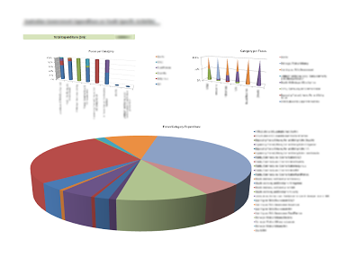
Now, Stephen Few would spew if presented with such a report. I did everything I could to obscure the report – added 3D effects, presented the amount in 100% stacked graphs when absolutely not necessary and, of course, I had to add a Pie Chart. A 3D Pie Chart. The whole report is totally useless. It is impossible to deduct the actual numbers of the various category/focus amounts. Furthermore, the Pie Chart combines the focus and category and uses virtually indistinguishable colours for the different slices. The 3D effect distorts the proportions of these slices and if printed in Black and White, or if viewed by a colour-blind person, the report looks like this:
Since my goal of total mystification of the report was achieved, I sent the second prototype back.
The response was: “It looks much better, and we really like the top right bar graph and the Pie Chart. Would it be possible to leave just those two and change the Pie Chart to show data broken down just by Category?

So, the users did not like my combined series. A point for them. Then I decided to remove the 3D cone graph, to remove all 3D effects, to make it more readable and to create the following 3rd prototype:

Here, we can see that the pie has the actual percentages displayed, and each category amount can be calculated from there. The stacked bar graph is again almost useless.

The users liked it, but still thought that it was too revealing, and were particularly concerned with the fact that there are a couple of “invisible” categories (the ones with small percentages) on the Pie Chart. They had a new suggestion – change the pie chart back to a bar graph and play with the format, so that even the smallest amount is visible. I offered an option, made another prototype and it finally got approved. The exact words were: “The graphs are exactly what we want“. There it is:

The Y Axis in the first graph is interesting. Not only that there is a “scale break”, but in fact the scale is totally useless, as it is manually adjusted, because of the big gaps between the amounts. I needed two scale breaks, which for a series with 6 values is a bit too much. You can compare the normal linear scale of the first Prototype I created and this one. However, it hit the goal – my users were satisfied.

I consider this effort to be contrary to be an exercise in “Data Mystification”. It is very easy to draw the wrong conclusions from the report, and it achieves the opposite to the goals of Business Intelligence, as instead of empowering users, it could actually confuse them and lead them to making wrong decisions.